
Logo redesign: From Big Monster to Big Color
About a year ago I had the opportunity to redesign Lynn Imaging’s Monster Color logo.
While the previous logo certainly had “Big Monster” going for it, it was missing the idea of “Big Color” and the huge color graphics they print. This rebranding focused on cleaner, less “scary” typography and color.
I really enjoyed working with this concept and playing with the idea of mixing “monster” and a “color printer.” I experimented with everything from the idea of a printing press and paper, to color ink splatters, and even the idea of a “monster’s eye.”
Color played a very large part in this process as well. The former logo’s color scheme was not cohesive with the clashing greens, hard to read yellow and light blue and the harsh black. I began the color process by experimenting with several different greens. Once discovering the right one, I took added the blue from the Lynn Imaging branding. After that, the rest fell into place quite nicely.
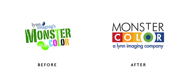
The redesign is clean, fresh and colorful and ties into Lynn Imaging without having to use their logo. In the end it was the idea of the monster’s eye surrounded by large blocks of color that won out. Best of all, this design was a great springboard for a product brochure.
You can view the logo in action on their website.
Leave a Reply
You must be logged in to post a comment.